Friday, September 23, 2011

Urban Design: Nolli's Map of Rome


Nolli's Map of Rome, from Wiki's article.


A high-definition copyrighted group of the map in twelve sections is available for download, and hardcopy purchase, from the University of California at Berkeley depicting the 18th-century work by Giambattista Nolli, at this link.

The initial purpose of the map was simply to conduct a survey and produce an accurate depiction of the city. Being pre-automobile and in a heavily built-up environment, buildings and the spaces between them were the map's format. Streets were truly corridors.

The remarkable and compelling trait of the map, though, is its convention of showing in figure-ground format public spaces in white, with private spaces and structure in black. The flow of space without distinction between roofed-over publicly-accessible space and that which is open to the sky offers a surprising and profound manner of seeing the city.

While the distinction between "public" and "private" might vary in validity from time to time, the basic idea that a space could be visited as a commercial, religious or othewise public place supports the logic of Nolli's map.

It's graphically beautiful and I consider it a great learning experience for anyone with interest in urban design.

Monday, February 21, 2011

Gehry, updated.


Experience Music project, Seattle
.
Frank Gehry's career seems to be hitting its stride.
.
.
At 82, he is still at the center of some of the world's most interesting and acclaimed projects. Among his projects that have been built or publicized since this blog's previous Gehry post are the IAC HQ in New York (a very nice website from the link, by the way,) 8 Spruce St., also New York and the Cleveland Clinic Lou Ruvo Center for Brain Health in Las Vegas.


8 Spruce St., NY
.
Some people carp about Gehry's work. Anything done publicly is open to criticism, and some of it's usually valid, at least by some criteria. At the same time, Gehry is one of the most truly ground-breaking architects in history, and in my opinion his work holds lessons for anyone who would design buildings. It isn't necessary to design something visually similar in order to obtain the lessons and put them to practice. They can be useful in abstract ways as well as literal ones.
.
One of the pet criticisms goes to the "arbitrary" nature of his building forms, pointing out that they may be unrelated to function. This is a cheap shot, because any building that uses form in a way that departs from mere functional accommodation would be vulnerable, and the world would be a much duller place without art. Architecture has been used as a means of expression in addition to, or even exclusive of, functionality throughout its existence. Gehry has referred to Alvar Aalto as an influence, and Aalto's work followed a similar path from concept to construction, celebrating the "arbitrary" expression of form and material, and the physical detailing necessary to bridge the possible distinction between art and architecture.


Cleveland Clinic, Lou Ruvo Center for Brain Health, Las Vegas

Related criticism can be that "it's impractical." Yes, it's always impractical to do something that exceeds functional necessity. Every age since the dawn of classical Greece has tried to find new and valid ways to express itself in its built environment.
.

In the hands of less inspired, less capable hands than Gehry's, buildings of the ambition and general character associated with his work can be, and often are, failures. There is a sufficient appetite for distinction in architecture that much avant-garde work is commissioned that fails to meet even reasonable principles of design. Difference for the sake of being different, while not an inherently invalid proposition, can obviously lead to ridiculous and ill-advised work.

.
Gehry follows a path of, like Aalto, exhuberant creation and celebration of form, followed by relentless refinement, then a hard-nosed pursuit of structural and weather-resistent physical integrity of the building. I think the refinement stage is the most singular, and most critical, in the making of his architecture. (A look at the design part of the IAC HQ site gives a nice, if greatly abbreviated, glimpse of what this entails.)

Sunday, January 30, 2011

2nd St. Ln.

Macon Mayor Robert Reichert asked me to study the potential of alley development in one of the city's downtown blocks. A newspaper account of the initial meeting with property owners and agencies is here.
.
I had carried out a similar study for an adjacent block several years earlier for
Newtown Macon, a downtown revitalization group. That study is described here. Other priorities intervened, and that study was not developed. The block suggested by Mayor Reichert, however, immediately showed promise as having even more interesting and varied spatial character than that of the original block.


.
Alley entrance, 2nd St. Ln., at Cherry St. This alley is only 8 feet in width.
A small second-floor room attached to one of the buildings framing the alley
entrance is suggested as a gateway.
.
Patina has its charm. On a limited scale, Macon has a tradition of placing storefronts and restaurant entrances in alleys.
.
The advantages to doing so have increased since the migration of big-box retail stores to suburban malls. That is, with something like 200 feet from streetfront to alley, the depth of downtown buildings is much greater than is needed for specialty retail, restaurants and small establishments such as hair salons.
.
If one of the old buildings is subdivided into two ground-floor businesses, one fronting on the street and the other on the alley, the retail space can be halved for each business. In the case of a building with its long side as well as its back fronting on alleys, much greater flexibility is possible, with small shops of twenty-foot width or even less all along the long side of the building.
.
Alleys have unique aesthetic advantages. They are narrower than downtown streets. This evokes traits of European cities' narrow medieval streets, where perceptions are heightened by proximity to surfaces, storefronts and other people. Sights, sounds, smells of coffee and food preparation all build an experience that is likely to be superior to the routine pull-up-to-the-curb suburban shopping stop, and offer much greater social contact as well.
.


.
Plan view. Brick paving, trees and shrubs indicated delineate the public amenities at the block's center.
.
Since the establishment of suburban retail malls, tenants of downtown spaces are usually what can be called destination retail, places whose products are unique enough to cause a special trip to buy the things they have to offer. This is particularly true of an alley development, where a walk of a block or more may be necessary from a parking garage or street parking space. (Diagon Alley in the Harry Potter stories requires special knowledge to even gain admittance.)
.
Bakeries, restaurants and pubs, art galleries, and wine shops are among the stores likely to find a good fit in an alley development. An urban bed and breakfast or small hotel can find a ready market amid the street life and bustle of the alley side of a downtown block.
.


.
Above, viewed from higher level
.
Below, eye level.
.


.
Below, Cherry St. Ln. alley entrance at 2nd St.,
with suggested wrought-iron signage.
This alley, perpendicular to 2nd St. Ln., is 16 feet in width.
.


.
Below, part of the existing block.


related links:

Old Pasadena

Michael Scott

New Urban Network

Note: All drawings and photos in this post are copyrighted and may not be reproduced or used without my written permission.

Tuesday, June 1, 2010

Urban Design, Recent Lessons


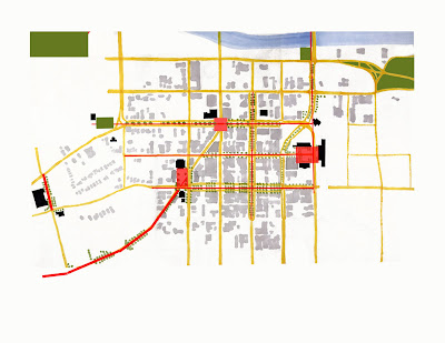
Downtown Macon, with some of my firm's urban design work in red.
.
In the years since the project described in the preceding blog, "Urban Design, Early Lessons," I've had several opportunities to put those lessons to work in Macon, and had a few more, as well.
.
Macon, Georgia is a city of about 100,000, replete with urban design opportunity. When the streets were laid out in the 1820's, the planners envisioned "a city within a park," and included three grand boulevards about 175 feet between building faces, two parallel and one perpindicular. In the hundred years from the first railroad coming to the city in 1843, Macon prospered from its location as a cotton distribution center, as well as being a railroad hub.
.
Its building boom of the late 19th century left Macon with a substantial collection of downtown mercantile buildings to complement its nearby antebellum residential areas. The city did not continue to grow at a rapid pace following WWII, however, and escaped many American cities' wholesale demolition of its earlier architecture.
.
The construction of a large regional shopping mall in 1975 quickly drained downtown of much of its retail trade. It became an office center, one, like many similar cities, with more empty commerical floor space than would be desired. However, its charm continued to draw energetic support from downtown interests and from nearby Mercer University.
.

.
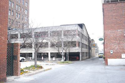
"Before" photo of alley parking deck.
.

.
"After" proposed paint of alley parking deck. Existing dowtown housing is at left, and restaurants have entrances on this alley. (The alleys project in more detail here.)
.

.
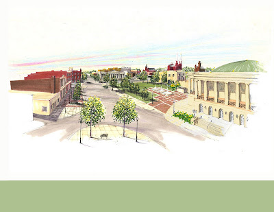
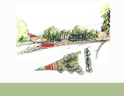
Proposed Civic Square (discussed in detail here.) A limited version of the project was completed in 2000. The illustration depicts a fountain and more complete landscaping, pending further property acquisition.
.

.
Intown circulation scheme, 1994, collaboration with W.P.Thompson, AIA. This proposed scheme of transportation corridors was the initial basis for a successful sales tax referendum which funded a $325M county-wide road program.
.

.
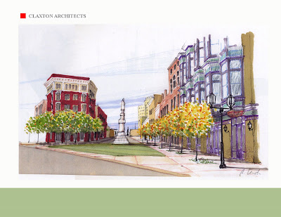
Proposed statue relocation, extension of one-way Cotton Avenue, and relocation of traffic entrance of Cotton Avenue to Second St.
.

.
Vineville Avenue gateway to downtown was proposed on the site of a vacant gas station.
.
Some projects of urban design are very specific in their purpose and location, others may be more open-ended, with an overall concept that has partial implementation initially, and recommendations for future work that may be taken up, modified, or rendered obsolete by unforseeable changes in the city's fabric before the time is ripe for their final development. One very specific project in Macon was pedestrian and landscape amenities for a busy intersection adjacent to the county courthouse. It's described here.
.
In each urban design project, the process loosely followed the experiences I had with James Pratt in Dallas years ago. The assessment of a particular context, its existing assets and possible improvement, especially when coupled with a broader view of which that context is a part, has always been a rewarding and usually challenging process.
.
While most of any project's stakeholders are receptive to a well-thought-out urban proposal, many have a legitimate basis as stakeholders for opinions about what should be done, and how. This means that the design team and any associated agencies need to make clear at the outset that public input is welcome. Most comments are useful, and while some of the ideas and desires thus expressed may not be feasible, the value of public discussion and debate is real. After all, a public place should reflect the public that owns it, and part of the skill needed to bring a project of this nature to fruition is the engagement with those who have a stake in the outcome.

Urban Design, Early Lessons

After college I had the good fortune to work in the Dallas firm of Pratt Box Henderson. James Pratt was the principal with whom I spent most of my four years at the firm. One of the most valued lessons there was one of James' urban design projects, The Core Boulevard Plan.
.
This was a conceptual design for, among other things, a system of boulevards linking the high-rise core of downtown, Baylor Hospital, and Fair Park. Significant street realignment, and some relocation, was proposed in the Fair Park area, and an upgrade to boulevard configuration was recommended for east Main Street and a corresponding length of Canton Street, with Canton and Marilla merging into one Canton Boulevard.

.
Other goals set forth in the plan addressed inclusion in this boulevard network of the newly identified Arts District, the old Farmers' Market and the Convention Center.
.
The Arts District was, in the early 1980's, only a proposal for a concentration of museums and performing centers. Since that time, substantial investment in this District by Dallas interests in the arts has resulted in a large collection of built work by world-class architects.
.
The Farmers' Market has belonged to the City of Dallas since the 1930's, but its presence on increasingly valuable downtown property meant that the city had to decide whether to honor its historic location or move it to less pricey real estate. In the years since the 1980's it has become a more fully institutionalized presence, having grown and achieved permanent residence in what at times had seemed a tenuous location.
.
Dallas Convention Center has become a huge complex immediately west of City Hall.
.
At various points along the generally east-west, half-mile long axis of the plan, potential locations of plazas, sculpture or dense landscaping were noted. In particular, the intersections of Canton St. and Exposition Ave., and South Harwood St. and Young St, at the Scottish Rite Building, were recommended as landscaped plaza locations. The Canton/Expostion plaza was built several years later.
.
The "lessons" contained in this project were, for me, numerous. First, the fact that design on this scale is perfectly within the purview of architects. Second, the enthusiasm of the people and institutions who are natural stakeholders in such projects is potentially huge. Third, the natural and direct process of forming and developing a conceptual plan which links and benefits large systems within a city is precisely the same process, with only a few additional considerations, as that of designing a building and its site plan. Finally, clear understanding of the potential for each downtown "district" was brought into focus in a plan which sought to create physical connections between them. Both the functional uitility and the urban aesthetic of the connecting corridors built on each district's potential and fostered a transcendent one for the overall Downtown. So, a vision was expressed that held obvious benefits for all the stakeholders involved.
.
In considering a project of this type, it's interesting that a hierachial view of potential spatial emphasis seems to arise naturally from skilled observation of the project's path. The presence or suggestion of iconic structures, their relation to traffic corridors, history, landscape feasibility, amenities of shade, water features, sculpture, all blend into the repertoire of the potential project.
.
Attention to spatial opportunites, coupled with a broader vision than that of, say, a single intersection of streets, can give rise to synergistic combination of traffic corridors, existing and new architecture.


.
Core Boulevard Plan, Pratt Box Henderson and Partners, Dallas, Texas. 1980.

Thursday, April 22, 2010

Jaume Plensa

"Every human being is a 'place.' Every woman, every man, every child are themselves a living-space which moves and unfolds; a 'place' in the sense of time, geography, volume and color." - Jaume Plensa

He is a sculptor rather than an architect. His work is well-known and is exhibited globally.


Photo by carthesian. wiki image. I used this image for convenience, because it's free for use if attribution is given. If you'll look into Jaume Plensa's website, or do an internet search of images of his work, you may find it rewarding.

Friday, December 4, 2009

Christopher Alexander


One of the more influential and worthwhile contributors to 20th-21st-century architectural theory is Christopher Alexander. ("Influential" is a term with quite a lot of wiggle-room, and the effects of his influence haven't reached the level that can be hoped, but a growing number believe they will do so.)

I'd describe him as a highly intellectual person who argues sincerely and convincingly for what could be called non-intellectual bases for design. In his 1982 debate with Peter Eisenman, he said, "But I really cannot conceive of a properly formed attitude towards buildings, as an artist or a builder, or in any way, if it doesn't ultimately confront the fact that buildings work in the realm of feeling."

Applicability of his concept and articulation of pattern language has significantly affected computer science. "The idea of a pattern language appears to apply to any complex engineering task, and has been applied to some of them. It has been especially influential in software engineering where patterns have been used to document collective knowledge in the field." (wiki article.) A Microsoft MVP's blog illustrates a software professional's take on Alexander's work.

Personally, I think one way to look at his books, lectures and articles is analogous to employing gravitational lensing, where the actual location of the source of something may be different from its apparent location, but its visibility and its magnification is made possible by the gravity of an intermediate (in this case, Dr. Alexander) object bending the light. That's a round-about way of saying that the truth and value of his ideas could be, for any particular person, something other than what a straight-up literal interpretation might convey. At any rate, I think there is truly substantial depth and value in his theoretical work. He was recently awarded a prestigious affirmation of this work, the 2009 Scully Prize.

Two of his books read and re-read by some of the more dedicated architects since college days are "The Timeless Way of Building" and "A Pattern Language." (A nice summary of "The Timeless Way of Building" is here.) A remarkable attribute of these books is the use of black-and-white photographs which often perfectly complement, sometimes greatly explaining, the ideas articulated in the text. More recently, he has published a four-volume opus, "The Nature of Order."

One of Alexander's central tenets is that human provisions for dwellings and cities reached their most valid and meaningful achievements prior to (or otherwise separate from) the work of professional architects. His analysis and cataloging of the factors that best "resonate" (his word) with us in our built environments are truly significant achievements.

Timeless

Anything built that uses a lot of resources may show evidence of a preference for achieving timelessness. Actually, some people deliberately eschew the desire for this type of immortality, but the desire for expression of the moment probably trails the desire for lasting validity. "Lasting validity" is in the eye of the beholder, but it seems a useful synomym of "timeless."

All "classic," "timeless" designs were at some point created or derived from ideas that were "trendy" and "of the moment." Those achieving "lasting validity" possess traits that elude the passing of time - they evince what could be regarded as principles containing "truth."

Christopher Alexander dwelt on this subject for years. He published books that, themselves, probably achieve the "timelessness" that he analyzes and explains regarding the built environment. I think Dr. Alexander's beliefs are valid, as far as they go, yet other architectural achievements with which he at least provisionally disagrees sometimes achieve "lasting validity" as well.

Mies van der Rohe's work is one example of "at least provisional disagreement" on the part of Alexander. The "lasting validity" of Mies' work is generally credited to its refinement of proportions and absence of details which distract the eye. In other words, highly competent (in Mies' case, masterful) minimalism. Mies used the richness of materials and of context as the sole relief from sterility in his buildings - and he didn't always do even that. The human difficulty with places crafted by Mies and other minimalists lies in its aversion to clutter - a minimalist composition is ruined by things that can be visually absorbed and "accepted" by the vernacular places that Alexander cites as comfortable and appropriate for human use.

Personally, I'm glad for the contributions of Dr. Alexander and for a number of architects who would at least superficially appear to be at odds with his theories - different contexts both require and allow for different approaches. (Mies' Seagram Building in New York needs no explanation or apology.) That said, I personally and strongly agree with Alexander that a lot of misdirection has been foisted on the world by the more posturing, psuedo-intellectual proponents of 70's postmodernism and 80's deconstructivism. Some interesting architecture and possible clues for future development has evolved from the essentially nihilistic pursuits of Peter Eisenman and others, but their more proximate effect seems likely to become historically regarded as a blind alley. Eisenman's design for the Alteka office building in Tokyo is an example of his work. Poseur?

A famous and definitive debate on architectural theory took place at Harvard University in 1982, between Christopher Alexander and Peter Eisenman. It's linked here.

Archinform thumbnail biography and list of publication by Christopher Alexander.

A gallery of built work of Christopher Alexander's firm.


Saturday, November 21, 2009

Sense of Place: Houston Lake 2

The previous post offered Houston Lake Country Club as an illustration of attributes that contribute to a palpable sense of place.

It's also the home of some truly world-class players of the game of golf.

Sissi Gann captained the Georgia team that won the 2009 United States Golf Association Women's Amateur Team Championship at Fort Wayne, Indiana.

USGA described the competition here.

Amateurgolf.com's article is here.

Houston Lake club owner Chris Murman wrote of Sissi Gann, "She is passionate, intelligent, full of integrity and respected throughout Georgia as an excellent golfer and as an ambassador for the game of golf." And, "She has won the Houston Lake Women's Club Championship over 20 times and won her flight in the Georgia State Amateur Championship this year."


Chris Murman and Sissi Gann.

Sissi isn't new to the realities of competition. Her husband, Stan, was a Georgia Tech quarterback before becoming a successful High School coach for Houston County championship football teams.


Stan Gann.


Sissi explains details on the National Championship trophy to fellow Houston Lake members.


Along with celebration of Sissi Gann and her Georgia team's National Championship, the chilly November sunset drew a good before-dinner crowd to the terrace fire pit and blankets.

Click on photos for full size.