Monday, August 31, 2009

Urban Design: Washington, DC and Paris


Camille Pissarro, Boulevard Montmartre au printemps, (1897)

Washington and Paris share remarkably significant traits, along with readily apparent differences. As national capitals, shared traits include numerous monuments, grand rivers and diagonal boulevards, excellent transit systems, signature totems positioned in vast parklands (Eiffel Tower and Washington Monument.) The traffic circles in both cities, made necessary by the diagonal bouleveards' intersections with other streets, create parks and landscaped areas that generally don't exist in rectangular street grids.


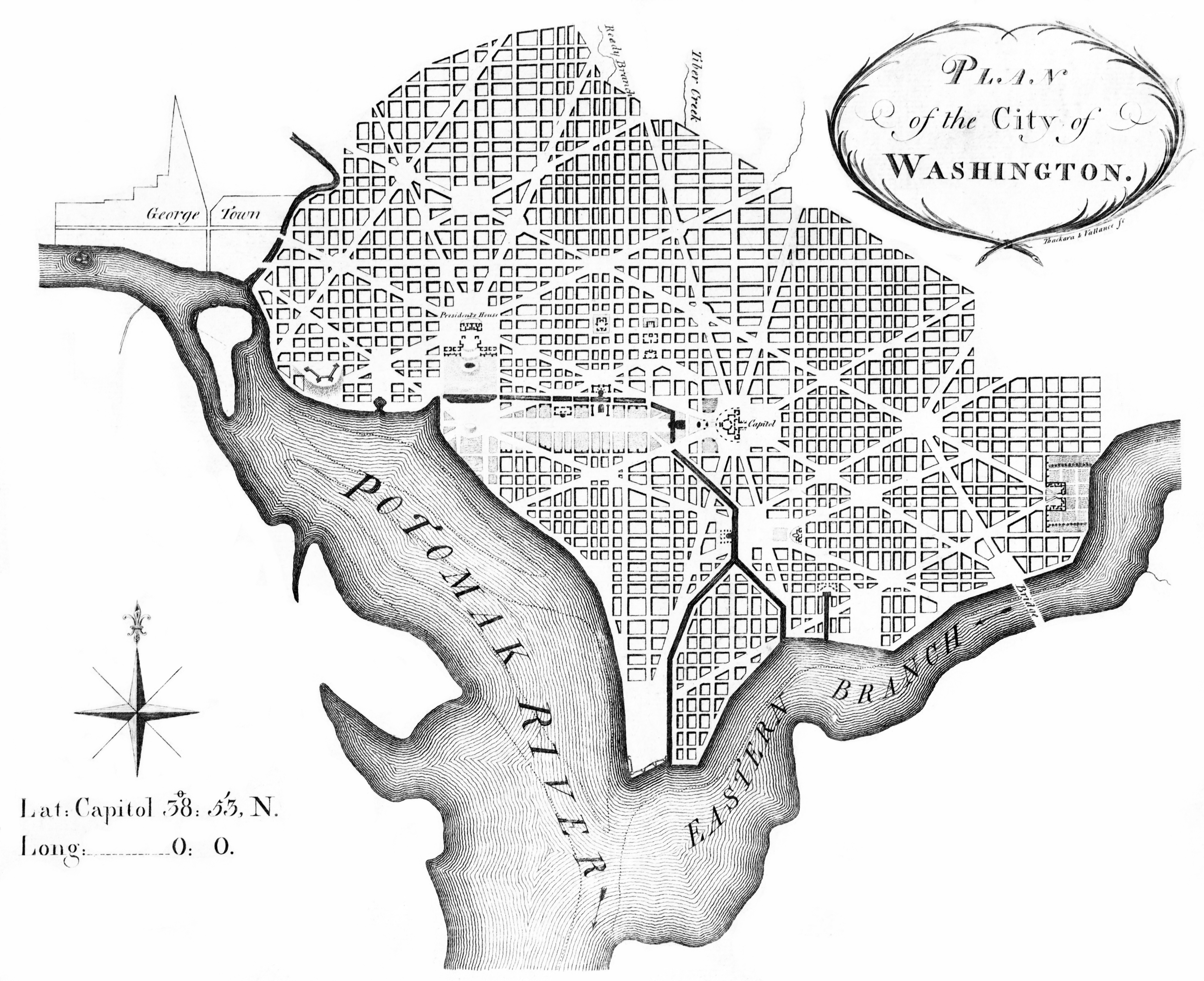
L'Enfant's plan for Washington, DC, as revised by Andrew Ellicot, 1792. Wiki. Click image for full view.


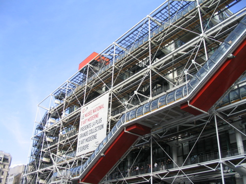
Michael Kooiman. wiki.
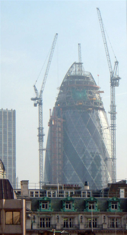


My photo.


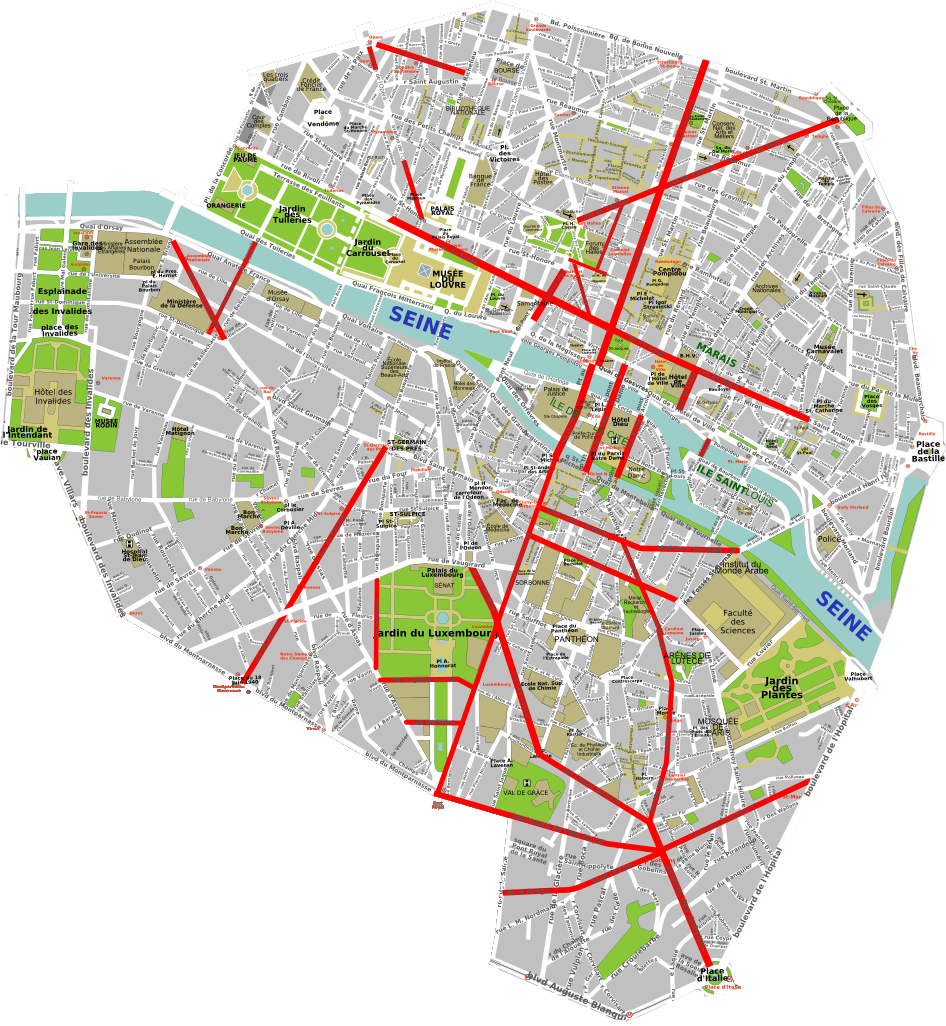
Napoleon Napoleon III and Haussmann's changes to Paris. wiki. Click image for full view.

DC is remarkable in that it was cast as a new city, with a sweeping master plan of streets, parks and primary structures. Yet, the city has a rich variety of architecture and urban spaces owing to the infill that occurred between the Olympian scale of initial placement of the Capitol and the White House, along with the Parisian diagonal grid and its traffic circles.

Paris was a very old city with a medieval character and its grand boulevards were, over time, cut through existing urban fabric by successive emporers, primarily and most recently Napoleon III. Its buildings are commonly made of limestone, uniquely available from vast mines below the surface of the city. Washington was the first national capitol to be laid out according to the design of a specific planner, Pierre L'Enfant. Even the most casual comparison of the two cities' maps shows the organic, complicated geometry of Paris in sharp contrast to the generally rectangular grid of Washington set in juxtapostion to its diagonal boulevards.

Both cities, though, have beautiful rivers, a wealth of parkland, generous public squares and "left-over" spaces created by the intersection of diagonal corridors with the differently-aligned adjacent streets. Their transit systems are both excellent. Paris' opened in 1900, DC's in 1976.

Paris' changes commissioned by Napoleon III were undoubtedly admired by Daniel Burnham, he of the "Make no small plans" quote. I don't believe that any existing city, without destruction by war or other disaster, has ever undergone rapid, planned changes of this magnitude. The emporer chose Georges-Eugene Haussmann to plan and carry out the changes to the city.


My photo. Street-performing band at DuPont Circle, DC. Despite the weight of government, both cities sport famously lively streets. Here's one from Paris.

Additional posts about some of the public spaces that have been created in both these cities will follow from time to time.

Saturday, August 15, 2009

Form Follows Function: 4, Architectural Design


1977. Pompidou Centre. Exposed trusses, ducts, electrical conduit, metal decking.
From *clarity*'s photostream, flickr.

Last of the form / function posts, for now anyway.

Functionally-shaped buildings are remarkably hard to find, other than limited groups which have clear and apparent forces at work to determine their forms:

Tents make up one group, with their push-pull structures and pliant envelopes. Some creative examples.

Yurts are another, or maybe a subgroup of tents.

Some industrial uses make up another group, with facilities like oil refineries, rail service structures and grain elevators.

Mobile dwellings, notably Airstream, are another. Houseboats, ocean liners and today's cruise ships are less confined in their formal characteristics than some of the structures in this list, but are quite recognizable for what they are and the purposes they serve.

The presence of functional imargery in building types without the overwhelming incentives present in the examples of the preceding list are much less common. This isn't surprising, but it can sometimes be a missed opportunity to mine the aesthetic potential latent within many buildings' program requirements. Renzo Piano and Richard Rogers designed the iconic and widely-appreciated Pompideau Centre in Paris. This museum is generally described as "high tech," but along with its high-tech imagery, it represents a studied effort to thrust many of the building's functional elements and processes into view.


Pompidou Center. wiki


From lewishamdreamer's photostream, flickr
Detail photo of Pompidou Center. Exposed structure, electrical conduit, service access platforms, welded wire mesh railing. This thirty-two-year-old building bluntly delineates functional elements as a deliberate, carefully composed aesthetic.

Rogers' one-time business partner, Norman Foster, carried his own inquiries into technical expression of functional imagery into the production of highly accomplished work. His firm's 30 St. Mary Axe office building in London is an exemplary collaboration between the architect, structural engineer Ove Arup and mechanical engineer Hilson Moran. The interwoven design is explained in this wiki article. It's unmistakable on the skyline, and has prompted hilarious nicknames, but is highly sophisticated structurally and mechanically. With due acknowledgment of "Towering Innuendo" and "Chrystal Phallas" nicnames, the more primary formal expression of this building is, I think, its triangulation of structure and aerodynamics, which evade wind loads while driving its natural ventilation system.


30 St. Mary Axe. London.

Through the broad sweep of architectural history, form has ebbed back and forth from unadorned functional construction to highly stylized periods like 16th-century mannerists of Italy or 18th-century Roccoco. The thrust has almost always been toward more sylized imagery. In the examples of mannerism and later roccoco, a stylisitc evolution matured, where increasingly numerous, layered factors influenced architectural expression with only the minimum necessary evidence of functional elements. In fact, function is often hidden, disguised or sacrificed to satisfy formal considerations. (Ironically enough, this occurred commonly enough in the 20th century and even now, trying to give a building a functional and machine-like image when its actual construction was of earlier, more primitive means and materials.)

Among factors likely to introduce opportunities for less arbitrary building imagery are those related to sustainability and the conservation of energy. Provison of fixed or movable shading devices, permeable, "breathing" envelope systems and wind turbines of various configurations can have substantial visible effect on a building's form. Partially underground construction is another potential form-giver. Integration of building envelope with plant material in both traditional and yet-to-be-developed ways offer intriguing departures from past and current design precepts.

Without trying to turn this into a manifesto, I think it quite possible that necessities of sustainability and conservation of resources, already increasingly evident, will over time usher in a technically sophisticated, broad design motif of literal and honest expression of function. Along with this, a new and widely understood aesthetic can evolve. Would or should this become a dominant aesthetic? I hope no realtively narrow aesthetic vision ever becomes "dominant," but I think new forms based on new capacities to intrepret and produce them is positive and an altogether exciting prospect.

Of general interest, an outstanding archive of Thomas Mayer photos.

Wednesday, August 12, 2009

Form Follows Function: 3, Sailing Ships' Design


19th-Century British warship. wiki Click here to see full view.


Dutch Man O' War. wiki Click here to see full view.

Sailing ships are another class of objects that visually express their functions, often beautifully so. Few objects so clearly exhibit the functional purposes of individual elements as do these ships. The intricacies of full-rigged ships have been an undying source of fascination for centuries.

17-century merchantman. Dorset County Museum. wiki


A 17th-century warship. Vasa Museum, Stockholm.

The main functional bases of form spring from the capture of wind, sails; the need for balance, ballast; and the means of controlling direction and the amount of sail deployed at a given time.

Extensive descriptions of American sailing ships are available here.


All other things being equal, the more sail area, the more wind can be captured. The size of sails was limited by how they could be handled, so the vertical division of sails evolved into multiple tiers. The area exposed to the wind could be controlled by complete or partial gathering and unfurling. Access was provided by means of rope ladders and other rigging components. The process of managing the sails was essentially a push-pull relationship between the sails, masts and hull by means of ropes. The combination of these elements makes up the ship's rigging.


I asked a friend with a USCG captain's license, Lanny English, about the jibs, the triangular sails at the front of a ship. Along with defining apparent wind, he explained that these sails provide lift to the ship's prow, needed because the force gathered in the sails of the other masts tend to push the front of the ship down, as the height of the masts have the effect of levers. Lanny also pointed out that the action of wind and sails is analogous to lift on an airplane wing, with the "lift" effect of the void on the downwind side of the sail pulling while the direct wind force hitting the other side of the sail is pushing. A further explanation of the physics of sailing is here.


Click here to see full view. Here, the arrangement of masts, hull and stays clearly illustrates the structural system they comprise. This is a two-dimensional diagram, though, and a 3-d view would illustrate rigging that is perpindicular to the plane of this drawing. Article here.

Hull thickness had two main variables other than structure and water-tightness. These were simply whether the ship was expected to withstand shelling or not. A man o' war would tend to have a much thicker hull than, say, a whaler or freighter.


Hull configuration was largely determined by an inevitable tradeoff between stability and speed. For military use, though, a more complex array of factors came into play. A good artilcle describing the evolution of 19th-century battleships.


Links


Rick McClain A very complete glossary of terms for sailing ships.


Saturday, August 8, 2009

Form Follows Function: 2, Spacecraft Design


NASA. International Space Station. (As always, click to zoom.)


I think the Lunar Landing Module is one of the most completely functional-looking objects I've seen. It looks like what it does, to a remarkably interesting and convincing degree. This owes to many factors, it was obviously a complex product with exacting functional requirements. (Even if one doesn't have a clue as to what most of those functions are, it's still a business-like image.) Its movements took place without atmosphere, so aerodynamics weren't necessary. Also, there was no apparent preconception as to what exactly the spacecrafts in the Apollo mission should look like - at least in the sense that it should resemble Flash Gordon's rocket or any other particular object.


Shuttle photos. NASA. (Very high-resolution versions of photos are available on that site.)

The US space shuttle is marginally less prickly in appearance than the LM, because it has to contend with air resistance on reentry to earth's atmosphere. This necessity drives much of its configuration, and all of its external materials. The 26,000 tiles' hand-wrought appearance is misleading. They're each carefully machined, then fired in a high-temperature furnace. I read somewhere that each tile cost about $10,000. Theoretically good for 100 missions, many are replaced after each mission for various reason, often because of debris contact during liftoff. Viewed up close, their notations and visibly uneven alignments are a fascinating part of the image of this spacecraft.

Architects, how many times have you seen very specific forms copied from past projects, such as Greek pediments, or Gothic spires or the repeated appearance of Richard Meier's or John Hedjuk's extruded-piano volumes? Not that each new project has to represent either formal or functional reinvention of the wheel, but this illustrates the degree to which preconceived forms may be arbitrarily applied.

The modern movement in architecture, from around 1920 on, focused early on the elimination of ornament. This was partly the "machine aesthetic," where "machines for living" were conceived. The effect of the "machine aesthetic" was often a caricature of the ideas it purported to champion. Smooth ocean-liner forms in buildings were frequently tradional masonry construction with a stucco veneer, or in some cases an actual make-over of an older building with an applied facade, a pastiche of the "ocean liner style."

So, the achievement of truly functional imagery in architecture or other design, if you'll accept for the sake of argument that it's a worthy idea, has at least two requirements. One, the discovery of functional elements that lend themselves to visual expression of their functions. Two, assembly of a system of functional elements into a composition that maintains functional imagery without becoming an arbitrary pastiche of functionalism, itself.

Personally, I think that one doesn't have to be a car to sit in a garage. Some architects have strenuously stated that they recognize no obligation to express function of a building, either in whole or in part. It isn't a purpose here to convince anyone for or against a worthiness of functionalism. Rather, this is an exploration of the process by which functional imagery within a design can come about.

Next, sailing ships.

Thursday, August 6, 2009

Form Follows Function: 1, Design at Large

"Form follows function."

The implications of the phrase are a preoccupation of many architecture students and architects from the earliest classes in design. In general terms I think it's an idea that can be argued from either side regarding its validity and value. More specifically, the matter of just to what extent designers can claim that their solutions actually reflect the functions of a product is a basic, and persistent, issue for many. After all, there's usually a lot of wiggle-room within the options for the exact form of an element of a complicated assembly.

Non-architectural examples may better lend themselves to a function/form consideration than buildings. I setltled on automobiles, guns, ships and spacecraft. They all have the advantage of visibly moving parts, and kinesis of any kind makes an object's functions more readily apparent than something relatively static like buildings. A return to architectural examples follows the kinetics.


1937. An early Volkswagen Beetle. Teardrop aerodynamics. Aerodynamics can be a fundamental design factor in the form of an automobile. (Didn't always happen.)

(An update, March, 2011.) On the subject of aerodynamics, this article is of interest.

Years ago I read one of Arthur Hailey's books, Wheels. It was interesting and had a plot thread that was worthwhile and memorable. This concerned a new vehicle with a new image, based on conceptually blending the Volkwagen and the Lunar Landing Module. Both of the proposed role models for the new vehicle were certainly functional-looking, especially the LM. This was all a riff on the form-follows-function precept. The idea was that something designed so purely for functional performance would have its own kind of beauty, its imagery having added gravitas and integrity for clearly expressing its functions.


No air, no aerodynamics. Lunar Landing Modle. wiki

Objects designed with what strikes us as remarkably functional imagery can tend to have high design budgets, or virtually no design budget at all. Money was no object in the case of the LM. The VW was a sensible design, as are the fundamentals of most cars. Anything to be mass-produced supports a lot more time in design refinement than something that is to be a unique product, used one time.

Round wheels, (right?) aerodynamics that we can intuitively recognize, the presence and configuration of obvious functions like exhausts, interior and exterior rear-view mirrors, etc, all contribute to the image of a car. A significant difference in the VW and competing US cars in the 1960's was that the US cars tended to be much more consciously style and status-symbol-image-driven in their design. The VW had its own symbolism of status, of course, with many of its owners able to afford a bristling status show, but finding more satisfaction in the VW's practical image. Ostentatiously anti-status. VW had an advertising campaign for years that brilliantly played up the car's benefits, and its anti-status image.

I think inner "chatter," images and preconceptions that all designers tend to bring to their work, is one factor in making purely functional design with virtual elimination of arbitrariness a virtual impossiblity. This would be less true of some objects than others. Again, relatively generous mass-production design budgets can tend to further the functionality of products' images. A gun, for example, can really look like what it's supposed to do. Variations are apparent between different guns of a given era, but in at least a general way they usually derive from functional differences. Still, choices regarding specific details that follow prejudices and preconceptions can usually be spotted.


1860 Colt Army Revolver. wiki

An interesting and functional image is that of a gun manufactured in 1860, the Colt Army Revolver. While a revolver, it was an early one. Here's a general breakdown of why it looks the way it does:


  • I'm not sure, but I think it was possible to load from the muzzle, meaning that the bullet and powder was inserted into the end of the barrel. It was also possible to into the revolving cylinder. The bullet, which was a lead ball, and powder was typically sold in individual paper cartridges, prepackaged. After being placed in the cylinder, the bullet and powder were compressed into the cylinder's chamber using the lever visible below the barrel.

  • At the back of each bullet chamber is a niche for the primer charge, also called a percussion cap, which was ignited by the hammer, and in turn ignited the main charge in the firing chamber.

  • The shape of the grip is that of a typical handgun, shaped to fit naturally into the palm of the hand. It is coordinated in its dimensions, shape and angle with that of the trigger and trigger guard. The top of the gun is straight. The bottom and sides, forward from the grip, are canted, streamlined for moving in and out of a holster.

  • The hammer consists of a single piece of formed steel. It has a thumb lever, serpentine and flared at its end to allow convenient contact when cocking the gun, a tapered firing pin that, when the hammer is sprung, ignites the cap, and the requisite hinged connecting section.

  • The long barrel increases muzzle velocity and accuracy. It has a perfunctory gunsight, but the back "V" part isn't visible unless the hammer is cocked.

  • The cylinder revolves, hence its shape. The niches on the sides assist turning it and disperse heat. Those behind them are housings for percussion caps.
Additional images of the gun are here.

An exploded view is here.

The point in this tedious description is that even with the relative simplicity of the function of a 19th-century handgun, a significant amount of design decision-making had to take place in the creation of its form, and hence its imagery. It's worth noting that the Navy version of this same handgun featured an octagonal barrel. This doesn't have a functional implication. It was probably just from the desire to visibly distinguish the two services' handguns.

The website of a company that makes reproductions of these weapons has a few videos that partially illustrate their functions.


I think one of two opposite conditions usually exist regarding functional imagery. Either the designer is more concerned that a product's image convincingly appear to reflect necessary functions than the extent to which it actually does so, or the image is so secondary that it isn't a factor in the design. If image is a primary factor in a design, highly functional imagery doesn't necessarily entail an intent to exaggerate or mislead. It is a legitimate and highly valued talent to be able to both logically and intuitively select from arbitrary options those options that do the best job of expressing function.


Next, the Apollo missions' Lunar Landing Module, the International Space Station, and the Shuttle.